
How to Balance Colors and Textures in the Bathroom
“If I want to be alone, someplace I can write, I can read, I can pray, I can cry, I can do whatever I want — I go to the bathroom” – Alicia Keys
I am sure most of us can relate to this feeling. After dealing with the stress of the day, a bathroom is where we find a personal sanctuary to just be with ourselves. That is why bathroom remodels are one of the most sought after features by new homeowners.
Related: How to Design a Bathroom Layout that Works
If you are thinking of adding some personal touches to your bathroom, it’s best to pay a lot of attention to how the elements come together. Decide between smart and rustic accessories, monochromatic and colorful bathing rugs, vintage or modern theme — and make sure the colors and textures don’t compete with each other for attention. After all, that is never a pretty sight. The idea should always be to create an inspired space.
Contents
Choosing the Right Color in Your Bathroom
Colors of every tint and hue have played a huge role in redefining the bathrooms today. Colors create:
- positivity,
- radiance,
- a mood to which each one of us connects individually
You see how colors can make or mar your bathroom interior? You should choose ones that have a positive impact on not only the aesthetic of the space but also your mood. Besides personal preferences, consider other factors before you make the final decision.
Factors to Consider While Choosing the Right Palette for Your Bathroom
One factor that can allow you to choose the right colors is the size of your bathroom. For instance, for a small bathroom, light colors are the right choice as they make space look bigger. Dark colors, on the other hand, are more suited for minimalistic master bathrooms.
Besides choosing the right colors, be cautious with how you use the colors with each other too.
For instance, say you use a color on a single wall and another color on the other three. This breaks the visual connection when you enter a bathroom — making your powder room look smaller instead. On the contrary, a single color on all the walls has the opposite effect.
Understanding Tones
Different colors make a different impact on the eye, hence changing the visual perspective. Red, orange and yellow are:
- essentially warm colors that reflect light
- move towards the viewer
- make the wall appear closer and larger
Pastels like pink, coral, and peach create the same impact too.
Blues, greens and violets:
- absorb light
- move away from the eye
- make the wall appear smaller and farther
The colors should be chosen based on what effect you are trying to create. If you are remodeling your powder or guest bathroom, we recommending centering your color scheme around colors that reflect light as that only makes the space look bigger.
Color Schemes
-
The monochromatic color scheme in the Bathroom
While the choice of colors depends on what one finds appealing, generally speaking, the eye adapts easily to a balance of shades. Here is where a monochromatic scheme really shines.
You can create a nice retro look where shades of the same color dominate the entire interior.
To have fun with this scheme, you can opt for rich materials and neutral colors as well. From ivory to tan — whatever you choose, the result will be the classic type or the look currently in, depending on how one blends the shades. Rose and wine shades when used as per the monochromatic color scheme in the bath work well to achieve a charming Victorian look.
-
Analogous Color Scheme for the Bathroom
Depending on individual taste, some like to use the analogous color scheme in their bath. In this scheme, colors that lie next to each other in the color wheel are used with different shades of the same colors
The analogous color scheme is widely used in an underwater bath where one could use blue-violet, blue and blue-green in different tints to achieve a serene look.
-
Complementary Color Scheme for the Bathroom
Then there is a complementary color scheme for bathrooms that uses opposite colors with their various tints. Let us explain this with a few combinations. Now a combination of a bright red and green would hurt the eyes. So we go for pale pink and a soothing variation of green instead.
Similarly, in place of opposite colors as blue and orange which must not be placed together, we opt for royal blue and peach instead. It works in the same way for each color combination.
-
Triad Color Scheme in the Bathroom
Triad is an interesting scheme, preferred by many because it uses three distinct colors that lie at equal distance in the color palette. To illustrate, red, blue and yellow are perfect to brighten up a child’s room and the same colors when toned down to wine, navy and pale ivory give an old-world charm of a federal room.
Understanding Texture in the Bathroom
Surfaces can be hard and smooth. But all elements in the bathroom have different textures. Imagine a bathroom with:
- wall tiles made of Glazed ceramic
- vanity tops made of marble or laminate
- porcelain fixtures
- metal fittings
- a wall mirror
None of these items have the same texture. But they too can compete with each other if not balanced properly. To do that. Unglazed or matte-finish tiles can be contrasted with marble floors. Similarly, you can contrast warm fluffy towels with thick rugs to reach a balance.
Why Balance Texture in the Bathroom?
Texture adds oomph to your bathroom and stands out as the highlight of the design scheme. The texture that is an amalgamation of both soft and hard elements changes the ambiance of your bathroom in a swish!
It also allows you to be creative. For example, you can have different textures for different elements within. What that means is that you can use one color scheme all over your bathroom and yet can have different textures for different surfaces.
Think wooden floor, a stone wall and a granite shelf counter in the same bathroom!
How to Balance Colors and Textures
If you keep the monochromatic color scheme but use different textures, this combination will make the space look subdued and classy. But if done wrong, a small bathroom with a conventional tub will look even smaller when set against a heavily patterned shower curtain. This is why the balance of colors and textures is absolutely essential!
Here are some tips to combine textures with the right colors:
- For small bathrooms, you are better off opting for a cubicle or light-colored curtains instead.
- Similarly, white cabinets give the impression of less space as compared to ones in natural oak against a given texture.
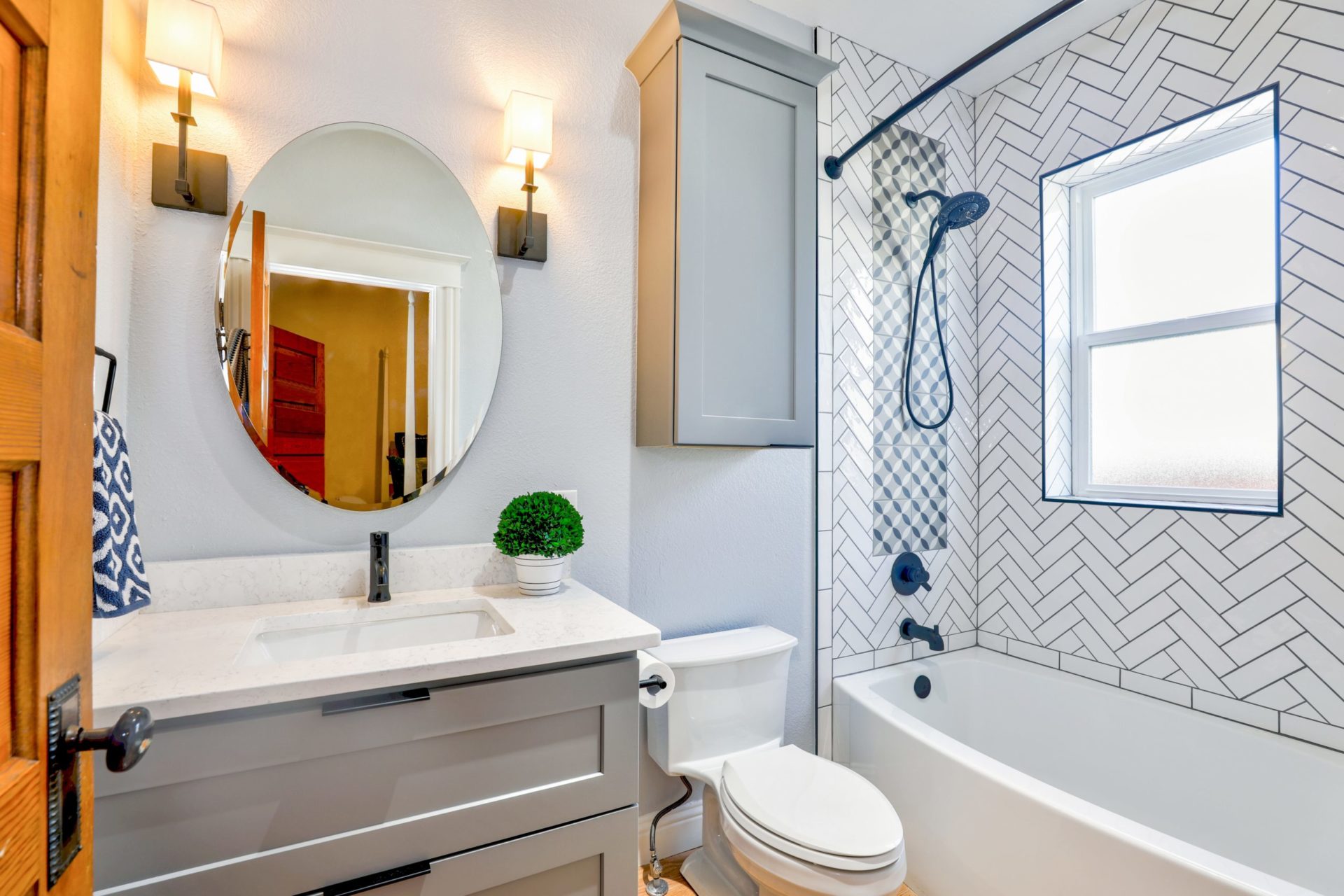
- A shower composed of linear stone with monochromatic color scheme looks stands for a fine balance between the color and the texture in the bathroom
- a countertop of natural stone with the rest of the bathroom in cooler tones brings in a certain coziness. Use it with wooden accessories that also have a similar feel to it.
- Try a red bathtub for a dramatic statement against a white textured bathroom.
- Here’s a really creative one: Have a retro telephone booth as a glass shower stall!
Final Word
We don’t want you to get too deep into the rules of colors and textures. At the same time, it makes sense to remember that interiors are all about balance. It doesn’t matter whether you go in for bright, bold or a neutral palette or any particular design style, the bottom line is balance.