Art In Conversation
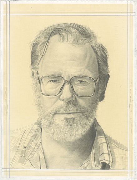
John Currin with Phong H. Bui
“Once I discovered my love of looking at paintings, I found myself falling in love with different painters.”
On View
GagosianMemorial
September 13 – October 30, 2021
New York
As I’ve followed John Currin’s career ever since his first one-person exhibit at Andrea Rosen Gallery in 1992, I’ve been equally provoked and perplexed, yet always fascinated and compelled by his vision of non-conformity. John is both a painter and a connoisseur who seems to treasure and thrive on the pleasure of absorbing countless methods, materials, and techniques from the painting culture as a highly personal practice and meditation. Since his mid-career survey at the Whitney Museum in 2003, John has undertaken various explorations of the human figure in unexpected terrains where, whatever lies in between things of perpetual discordance, the perceptible and the hidden, the issues of proportion and scale in his thinking of form and fiction has always stayed illusive to reductive interpretations. On the occasion of his upcoming exhibit Memorial at Gagosian, I paid a visit to his studio on Mount Desert Island, Maine, to talk about this new group of paintings during the last few days of their completion. The following is an edited version of our four hour conversation in the course of two days for your reading pleasure.
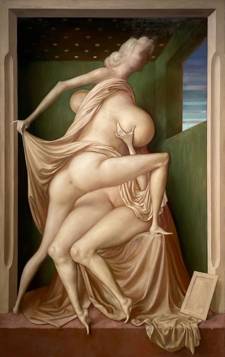
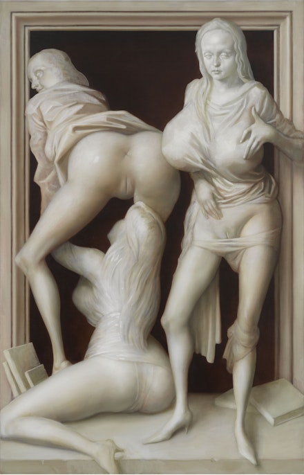
Phong H. Bui (Rail): Before we get to a discussion on the issue of grisaille in this recent group of paintings, looking at the Climber (2021) at this very moment, with the female nude stretching her supple body diagonally in front—I mean every part of her body is painted with such measure and diligence in endless pairs of opposites, which you’ve done before but never to this extreme, be it the large breast versus tiny hands and feet, small hands versus large torso, round forms versus pointed shapes, and so on—knowing you love Willem de Kooning, I can’t help but to think of his mediation between cubism and surrealism, especially from the mid to late 1940s, for example Pink Lady (1944), Pink Angels (1945), Fire Island (1946), where the sense of motion and speed is implied by the necessary and novel distortions that correspond to the fluidity of linear constructions across the picture plane…
John Currin: Yes, especially Pink Angels, and even an earlier picture like Summer Couch (1943) from which the later black and white painted with enamel paper on boards like Dark Pond (1948), Black Friday (1948), among others wouldn’t be possible. And of course, de Kooning’s spatial vision reached its peak in Attic (1949) and Excavation (1950), which in addition to the jam-packed fragments of the body, I also thought of Flemish drapery.
Rail: Which makes perfect sense since de Kooning was born in Holland (in 1904), and came to the US in 1926.
Currin: Right! At one point, after having worked on the drapery that draped around the two figures for one month, where parts were taken from [Hans] Memling, I realized it wasn’t working, so I made a real drapery set up on a box that I could work from. But in another example, the drapery in Sunflower (2021) is loosely cribbed from the Master of Flémalle’s Everyday Miracle: Nativity (ca. 1420s).
Rail: And it equally makes sense now that I think of the cutting sharpness and voluminous yet flowing style of the Flemish treatment of drapery lending its pictorial correlation to your recent interest in grisaille painting. I am thinking at the moment, for example, of Van Eyck’s The Annunciation Diptych (ca. 1435) at the Museo Thyssen-Bornemisza in Madrid.
Currin: I love that painting, and the back of his Ghent Alterpiece (ca. 1420–32), one of the greatest paintings ever made, as much as the front. Actually, I had a Flemish style drapery on the Climber for months, and I finally gave it up. I finally realized it wasn’t working. The left-hand part is taken from Van Eyck, but the rest is stuff set up in my studio, done in a more-or-less realist style.
Rail: What about Caryatid (2021) where we see circular forms echo throughout, without falling off the picture plane?
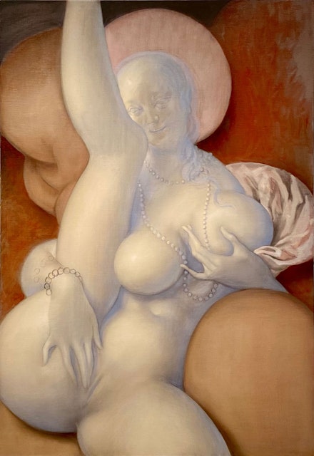
Currin: I thought of putting some crisp drapery behind, on her right shoulder. I’ll work on the incisions on the leg, then adding an Indian jewelry around her neck. In fact, I was looking at that nude figure (Truth) on the left of an old woman, dressed in black (Repentance) in Botticelli’s Calumny of Apelles (ca. 1494–45), one of his later Savonarola paintings. I just love Truth, being this odd, unsexy nude so I made quite a few drawings of her, readjusting her face and body from my imagination onto the painting in various stages, which can be very treacherous since everything begins with extreme distortions.
Rail: Therefore, it requires constant revisions!
Currin: Definitely, partly because of making subtle adjustments that relies on the difference between sizes and scales of the images, and partly because due to how different color pigment dries differently, for example burnt umber, which dries fast and matte, and is easy to draw on with charcoal on top, as opposed to yellow, orange, alizarin crimson, and so on which dries slow and at times glossy so I have to scrape it off with a knife, even sand it down entirely, in order to create a new tooth! And since I don't really make finished drawings, I prefer instead making super quick drawings on sketchpad before drawing directly on the painting.
Rail: I know. Can you share the impulse that drove you in creating these new seven paintings while shifting your interest to monochromatic palette in gray, otherwise known as grisaille, and grisaille comes from the French word for gray: gris?
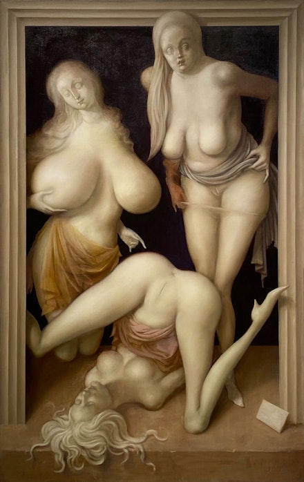
Currin: First of all, I had found these pornographic comics from the ’80s and ’90s, and the sexuality of them had this odd extremeness. They’re not sexy by any means, but personally, they were exciting to me. They were this weird combination of ’50s pin-up art like Alberto Vargas but with just very strange proportions. They also had these creepy fixations on people’s faces. Again, a lot of the oddness of this new group of paintings, the strange skinny legs, the flat, pointed shoes, the gigantic breasts, nobody’s really having sex, they’re just displaying, among other outlandish features, etc., etc., are results of many quick drawings that turned their cartoonish appearances into various gothic sensibilities. Take the left figure in Limbo (2021), for example, her face and gesture were inspired after the left figure of Saint Margaret in one of my favorite paintings at the Met, Cornelis Engelbrechtsz’s The Crucifixion with Donors and Saint Peter and Margaret (ca. 1525–27). Even though its format is horizontal as a rectangle, the painting was painted with different treatments of verticals of the figures. It’s simply a great and strange painting. The mannerism is his own, and it has this echo to the Byzantines, Gothic, as well as to the modern. Anyway, I made this 30-second drawing off the cuff, but it stuck with me, so I decided to turn the drawing verbatim into a big painting, 80 inches high. I worked on it forever, I couldn’t figure out what my color attitude was going to be, and it went all kinds of different places that it probably shouldn’t have gone. At one point, it became quite colorful, Florentine in flavor, and I did something foolish by mixing a paint that dried funny and ended up as a very shiny yellow, which meant that I couldn’t really paint on it unless I sanded the whole thing down. It had at least six beautiful things in it that didn’t belong in the same painting. It was a completely incoherent painting that was far too big for its subject. The subject matter was so rude, the asshole was too big, too public, too colorful. I finally let that painting die, sanded the whole thing down, decided to remake it as a grisaille, inspired by Bruegel’s small painting The Three Soldiers (1568) at the Frick. I wanted to make it somber, like they’re ghosts, with no color. I decided to make it very funerary, and about halfway into it I added a frame around it, like van Eyck’s Annunciation Diptych. Also, I had been using faces from advertising for years and years, and now I realized that these faces could be portraits of real people, so I hired models to come in, and I could paint their faces as sensitively and accurately as I could, and then turn them into stone. It was pretty intense, as I’d started that painting in January of 2020, and I finished it like the day we had to leave for the shutdown. We ran out to Long Island until when we ended up in Maine for the summer of the totally insane suicide of our society. You probably notice some of these Gothic heads I cribbed from various art books in the studio here or there, and I put some of Rachel [Feinstein]’s features on it, despite them looking so grotesque and strange. [Laughs]
Rail: They do indeed. [Laughter] At any rate, as we spoke of de Kooning’s Pink Angels, and other paintings of the mid 40s, there’s no doubt he was looking at Picasso’s Large Nude on a Red Armchair from 1929.
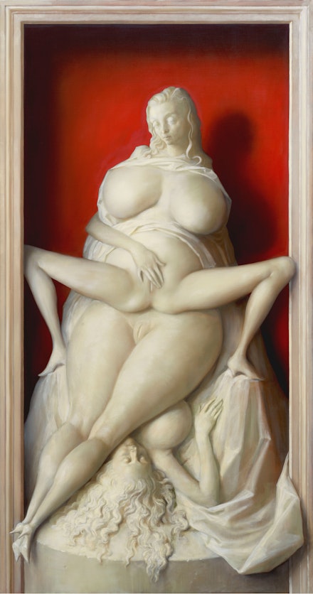
Currin: Definitely! It’s a masterpiece and a great parody of Matisse, with the empty frames in the background. Also, in addition to the stretching figure, the red chair and drapery in the frontal plane, I love the head in profile with a smile as an expression of pain. Over the last ten years I tried to make elegant, peaceful odalisques, with varying degrees of success but never entirely successful, but the idea of painting a stressed-out odalisque is appealing and is where I am right now.
Rail: I’d add it’s both a stressed out and a stretched-out odalisque. Do you think while the former is perhaps your own response to our current social, political situation, the latter is your excitement with a new pictorial invention?
Currin: To which degree on one or the other, it’s hard to tell, but I should mention the painting by Jean Cousin the Elder Eva Prima Pandora (ca. 1550) has been on my mind a lot, the menacing female nude with strange proportions, despite having been influenced by Parmigianino’s exaggerated Mannerist style. These grisaille pictures, framed by all the edges, sculptural and funerary, present as monuments, yet showing no shame. I couldn’t help but think of what’s going on in our country, all the monuments being taken down, driven by the idea that people are threatened by these emblems of power that they don’t have. People, acting with teenage rage, vandalized everything, statues of Lincoln in Spokane, the elk statue in Portland and so on.
Rail: That’s one of the reasons why we must counter speed and snap judgements on social media platforms with the “slowness” of culture. Just to continue with your acute observation and love for art history: in reference to Climber, were you thinking of late de Chirico’s gladiator paintings, which evoke strange homoerotic treatments of male anatomy, compression of space, and so on?
Currin: I love de Chirico’s gladiators, as I’ve often talked about them with Lisa Yuskavage and Matvey Levenstein. But for these paintings, I’ve been thinking of and looking at Konrad Witz’s panel paintings of Angels and Saints in niches, like Synagogue, Ecclesia, Saint Bartholomew, The Angel of Annunciation, all from his amazing Heilspeigel Altarpiece (ca. 1435), now dispersed in different museum collections like Kunstmuseum in Basel, and elsewhere in Switzerland. Also, I wanted to include a window within the window so to speak, with a 1970s Southwestern sky with horizontal strips of clouds in color, which made it less about trompe l’oeil and more complex and contemporary. Again, one of the interesting things when I look at these Witz paintings, everyone is clothed with this riot of drapery everywhere. When there is nudity, it’s somewhat embarrassing. There’s not much natural state of nudity, like many of Witz’s contemporaries this Northern idea of nudity is nearly impossible. For I’ve always felt a little silly in making paintings of nudes who were elegant and comfortable in their natural state. As I mentioned earlier, I’m interested right now in the opposite. I’m interested in both presentations of nudity that exist in our dreams, which can be both very exciting and very mortifying at the same time, and the nudity that gets portrayed in these cartoons, like a game of telephone where someone described what was attractive and it got very distorted very quickly. It makes me ask these questions: what do men like? Is this what I like? Is that what women like? Do both men and women talk about what they like to each other? Speaking of de Kooning, I too am interested in the idea of a figure in an interior. De Kooning will often have a room with some ruled lines on a somewhat visible grid, often including a window, which he gets from Picasso. He lets his impulses, his anxiety, all kinds of amazing shit happen within that given space.
Rail: You’re right, especially at the time of the “Women” paintings, the early to mid-50s, de Kooning was trying to paint the frozen glimpse as he told David Sylvester in an interview (1960). Famously, after having worked on Woman I for nearly two years, de Kooning took it off the stretcher and was about to throw it away. A few days later, he ran into the great art historian Meyer Schapiro on the street, and he told Schapiro how he’d been working like a dog on this one painting for two years, and how much he was dissatisfied with his inability to finish it. When Schapiro came to see the painting, in his typically Schapiro-esque way, looked super carefully for a good twenty minutes in silence, then said “It’s the best painting you’ve ever done.”
Currin: That’s a great story. That strip of silver paint on the right side is so hostile, so abrasive. It’s a classic de Kooning thing, loving Rubens and then saying to hell with him at the same time. It’s like saying I can’t play the nice guy for very long.
Rail: Super true, but I also see that strip of silver as a formal device to somewhat center the figure, otherwise it would slide off too far to the left.
Currin: As you said, he wanted to paint the frozen glimpse as fitting to his own anxiety. My anxiety is a different kind, one that finds real pleasure being excited by the idea of turning pornography into a bas-relief, or a sculpture. [Laughs] As we’ve been talking about de Kooning, I’ve realized that the most difficult thing in using monochrome is that I get so starved for color. The last year and a half, I’ve come to realize how much I hide behind color. I love those black and white de Kooning paintings, they remind me that in a way if you get the form right, you can paint it any color you want. It’s like what Picasso, talking about Bonnard, who he hated for Bonnard’s obsession with finding the right blue, said, “when I run out of blue paint, I use red paint.”
Rail: Picasso also said of Bonnard “he’s a potpourri of indecision” who couldn’t decide on anything. We should add that Bonnard is too sensitive for Picasso’s robust masculinity.
Currin: I’m also hostile to Picasso’s pure drawing, pure Southern European design. My sympathy is always with the Northern mentality, as a painter my sympathy goes to the Venetian school.
Rail: How would you describe your drawing style or technique, knowing that you’re not as invested in finished drawing?
Currin: My drawing is really just Abstract Expressionist American. If I forced myself, did a crash course or spent a summer studying, I could maybe draw a little better. Let’s face it, a classic American illustrator like Joseph Christian Leyendecker was fucking amazing. He could draw anything like nobody’s business.
Rail: I love Charles Dana Gibson’s drawing also. What about Jack Kirby’s comics! How amazingly distorted those muscular characters like Captain America, Thor, Iron Man, with foreshortened arms, amazing calves, six packs and so on! I’m glad that we’re having this honest discussion about drawing, John, because I’d in fact studied illustration in college, but I dismissed it as an inferior art until the Norman Rockwell show, curated by one of the most brilliant and irreverent art historians, namely Bob [Robert] Rosenblum at the Guggenheim in 2001.
Currin: The weird thing about Rockwell though, he’s a great artist, but the paintings are a bit dead when you see them in person. They’re only alive on the cover of a magazine or in a book. I’ve been looking at Hokusai’s Manga, the how-to-draw manuals. It’s got everything, people in various actions, all types of plants, landscapes, demons, all kinds of animals, including pages of 40-something cats licking their balls. All of the illustrations are prototypes, which is a completely different idea from Western art, but the same level of incredible encyclopedic mastery. He can draw anything.
Rail: As you know, the way in which Eastern artists make art derives from the internal translations of such manuals, they were never taught to work from nature directly. Copy after nature, or whatever you’re looking at would be considered inferior. Think of the image of Buddha, for example, meditating under the Bodhi Tree, trying to reach Nirvana, which means “not being here” the extinction of desire and individual consciousness. Now juxtapose that with the image of Christ on the cross, blood spilling out from the crown of thorns on his head, his hands and feet nailed to the cross in addition to his almost naked body with terrific gravity of erotic and sensual implications. Which image do we think compels more drama?
Currin: Christ on the cross is of course the most dramatic image ever invented in art. My feeling is that Christianity makes realism necessary, in order to convey Christ’s suffering, how he died for our sins. In mastering optical phenomena that are limited by time, not eternal, the artists, the maker, and the viewer, the worshipper alike are observing God’s work. To some extent, both are translators of how the image gets made and read. The goal seems to be to intensify our humility in relationship to the world, to nature. It creates a spiritual quest to understand nature, in a way I suspect other religions don’t in the same way. The cross is the best symbol, iconography, signifier, trademark that we could have.
Rail: True, as it may have started with how to translate the story of Moses at the battle with the Amelekites. Whenever Moses held up his hand, Israel prevailed, and when he let his hand down, Amelek prevailed. Aaron and Hur then held up Moses’s hands on both sides, hence Israel prevailed. If you were a monk tasked with translating this image on an illuminated manuscript as early as Hiberno-Saxon art of the post-Roman era, you would have to think of all the different multitudes of angles you could translate most effectively.
Currin: The frontal view is the most powerful I would think.
Rail: In spite of losing the broad view of the battle in either cases of profile or three-quarter view, which wasn’t invented until linear perspective in the early 1400s in Florence.
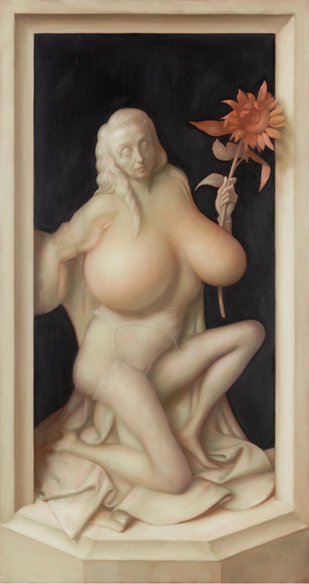
Currin: As Rachel was doing yoga this morning, I heard her instructor say we’re worshipping in the temple of our bodies. I thought about Jesus not being in the temple of his body, for his body betrayed him. The body is just a rotting piece of flesh that he generously decided to become. I find that so dramatic and so terrifying. And that’s the same reason why the idea of the perfect rhythmic and frontal nude puts me off a bit. Take Botticelli’s The Birth of Venus, surely one of the greatest paintings ever made. When the wind blows in an Italian painting, it makes these perfect sine waves blowing away from the hair. But when the wind blows in a German painting, as it gets away from the body, from the world, it becomes totally hostile. Satan is everywhere, and God is nowhere near controlling things mathematically. It becomes a terrifying fractal, where the image is turning into stone. It is at peace and static because it’s not alive. In Western art the idea of being alive is a total gasoline explosion, it’s a sunrise or sunset happening right now. That’s why the image of the sunflower gives a bit of life to the painting.
Rail: Looking at Rachel’s face in Sunflower, which reminds me of Clytie the water nymph, who turned into a sunflower, where every day she looks at the object of her unrequited love, Apollo the sun god, as he rode his golden chariot across the sky.
Currin: An invention by man no doubt.
Rail: Rachel and I once discussed how we are grateful to Carl Jung for the idea of the anima, the unconscious feminine side of man, and the animus as the unconscious masculine side of a woman, a more balanced view of the world than Freud’s predominantly male-oriented theory of libido.
Currin: Which I’m sure Rachel would say she’s more masculine than me at times! [Laughs]
Rail: Yes, she did! [Laughter] Anyway, regardless of the different critical response, positive or negative, to your work, I appreciate in a brief and perceptive text on your work in the catalog of his show Disparities and Deformations: Our Grotesque, Robert Storr wrote “your love for the medium of oil paint and painting is more important than the subject essentially.”
Currin: Once I discovered my love of looking at paintings, I found myself falling in love with different painters. I love the High Renaissance, the Mannerists of course like Parmigianino, Jacopo da Pontormo, Rosso Fiorentino, to name a few, as much as the Northern Mannerists like Maerten van Heemskerck, Cornelis van Haarlem, and Lucas van Leyden for example. The truth is I may be inspired by the face from a Botticelli painting, the torso from a Lucas Cranach, or the legs from someone else. As I told you, I also love American illustration from the ’50s and ’60s. There are lots of other sources that would appeal to whatever I was working on at any particular moment. It’s true that I work pretty hard to make the final painting look effortless but the truth is each painting requires so much: taking away what didn’t work, scraping and sanding parts, redrawing, repainting, which can turn out amazing or not at all. Either way, I love painting. I used to feel anxious when I was making abstract paintings, years ago, but once I began painting the figure, it brings me great joy.
Rail: James Lawrence seems to suggest your sense of technical acumen and sense of touch are both treated with equal terms of endearment. Even at the expense of what may be considered absurd, but also “absurdly” well-made things across the table, as Storr thought of it similarly.
Currin: When I see beautiful older paintings in museums here in the US, and all over really, I feel they are so alive, I connect with them as much as I do contemporary art. I don’t see art history as straight, linear, or progressive with all the rules and regulations. It’d be hideous to think that Picasso is greater than Rembrandt, or Ingres than Leonardo, or say Giotto’s frescoes are more beautiful than cave paintings. The past has never simply disappeared. We learn a lot from the past, so why not embrace it with pleasure and humility instead of thinking of it as an oppressive deadweight of tradition.

Rail: T.S. Eliot argued beautifully how important older writers are to contemporary writers. Homer, Dante, for example, are considered contemporaries of Eliot’s because they inform his work as much as his contemporaries like Ezra Pound, James Joyce, Katherine Mansfield, Virginia Woolf, and so on. I love how Eliot responded to someone who said something along the lines of “Dead writers are remote from us because we know so much more than they did.” He said “Precisely, and they are that which we know.”
Currin: We can also look at tradition with the lens of nostalgia, which implies kind of a sorrowful concession to mortality, as much as it is about the unretrievable past. Just as you can’t Make Arcadia Great Again, you can’t Make America Great Again, you realize at a certain age your childhood memories are not even memories, they are just a sensation of memories that fled us, irretrievably gone. I think the basis of my conservatism is that I feel this constant pain of losing time, losing things. What I’ve recently discovered in Poussin is that I don’t think nostalgia is really a comfort for him. I really feel he was longing through pain, not through anesthesia and living in a dream world, even though he knew such longings are revealed to be false and you get the sick feeling that he’s even unsatisfied with revealing his longing. What I’m getting at is the irony of that is intentional. People associate irony with cynicism, or a deadened emotional state. For me, I think it’s quite the opposite, irony is experiencing joy by observing pain rather than feeling it.
Rail: You’re fortunate to have arrived at this clarity. At any rate, in Poussin’s case, he had one foot in France, where the Cartesian logic was in his DNA, a natural composer of classicism, yet his other foot was in Italy, where he spent 40 years longing for Arcadia, which was impossible for him as you mentioned before.
Currin: The sensation of longing is so intense. Just like what we talked about with the difference between hair in Italian painting, where you know the hair follows a sine wave as it leaves the center of the head and body of the central figure, everything is still protected by God because it’s a rational world, even the breeze is rational, therefore you’re protected by God. Whereas the German paintings, the further anything gets from its center, it becomes grotesque, chaotic, and satanic. The hair goes nuts, the anatomy gets crazy at the end of the limbs, the hands are weird, so are the trees and everything else in nature. My feeling with Poussin is that he’s making an algorithm that will do what Italian paintings do in his French painting, but if you look long enough, you will see that it is unnatural. Yet it’s utterly intentional.
Rail: Without Poussin, it’d be hard to imagine the neoclassicism of David, Ingres, Antonio Canova, and others would be possible!
Currin: True, it all started with Poussin and then all the French began to look at and worship Raphael, from there onward we can see the intense French discipline and rage for order, which makes the discipline of Impressionism possible. And there’s a link of selflessness between them. I always hated what Ingres said “drawing is the probity of art.” Maybe I hated the concept of “probity” because I lack it. The kind of drawing I do is an ongoing patchwork, you might say. Any specific drawing I made for a particular painting is anything but for display. It’s not the probity of art. It’s rather a self-procrastination, masturbation session of art. [Laughs] I recently saw a lawn sign that said “HONEST, INTEGRITY, SCIENCE,” and I wanted to put a sign on mine that says “LIES, CORRUPTION, MAGIC.”
Rail: Perhaps it’s the American Puritanism that we all rebel against. Rudy Burckhardt, a friend of de Kooning’s, once told me a story in the late ’50s, early ’60s, when de Kooning was very famous: they were walking on the street and a young painter came up to him and said “How do you like it, when everyone paints like you Mr. de Kooning?” and he said “It’s not my problem, you know why? Because they all know how to paint the good de Kooning, but they will never know how to make the bad ones.”
Currin: That’s because they’re looking in the wrong direction. I’ve always thought you should look at the master’s students, instead of the master himself, where you can see their mistakes. At the heart of de Kooning, at least at the very beginning, he really wanted to make drawings like Ingres, but at a certain point, he just gets up, kicks over the table, and says “Fuck this, I don’t want to draw this way.” He’s realizing he can’t reverse engineer what he loves, and the only way forward is to work with his inability to be what he always wanted to be, or what he thought he ought to have been.
Rail: One can say the stress and stretch of de Kooning’s figure is his own way to overcome the anxiety of influence or of being influenced. In any case, as you told James Cuno in one interview, it’d be super hard for any young painter to look at a master like Rembrandt, I’m paraphrasing here, which can be so intimidating, so stressful, but they can learn a whole lot from Rembrandt’s students like Karel van der Pluym, Carel Fabritius, or say Ferdinand Bol.
Currin: It’s like what we’d talked before about a bad de Kooning versus a good de Kooning, I always hated the idea when everyone makes similar paintings. Many, especially when they get taught how to paint certain ways in the academy, would aspire to emulate the look of the final product instead of going through their own suffering or struggle to really question what they really wanted to paint, in spite of what they make may not be popular or even get attacked by negative criticism. Perhaps I was lucky, after having given up abstract painting a few years after graduate school (1986), I was making figurative paintings under the spell of everything Picabia and Magritte, especially his 1947–48 Vache period. I just love this non-conformist “fuck-it” attitudes. I remember my jaw dropped when I saw those Magritte Vache paintings. It was like probity had been thrown out the window. I also remember Wyndham Lewis’s amazing novel called Tarr, assigned in the class by David Carrier.
Rail: Who is one of the Rail’s most beloved Editors-at-Large.
Currin: He was an amazing teacher, and I’m grateful to him because I could relate to Tarr as a character who had intense disdain for the so-called “bourgeois-bohemians” all around him. And Tarr thrived on dark humor. This really blew my mind because I realized there was a whole side of modernism that just basically wanted to look down on the history of the past. There was this whole right-wing fascist strain, right alongside the progressive left, social, or whatever that I learned from that book. This whole idea of irony ran so deep that it’d take at least two pages, for example, to describe someone crossing their legs like a machine. There was a description like “the grandfather clock of his chin started ringing,” for example. Lewis then launched into these endless descriptions of weird hallucinations of machines. The novel was filled with hateful characters who had this hostile view of the world. Even though I didn’t at all like any of the characters in the book, it was totally fascinating to me, partly because it offered opposing views, or any kind of non-conformist view, like let’s not go along, get along kind of attitude.
Rail: Amen!
Currin: What I’d learned in my case was there were these amazing realizations, or recognition, which is as much about joy as about pain in terms of how it forces you to reflect.
Rail: Only if you surrender to the experience emotionally.
Currin: Right! I’d learned that it was more useful to look at Hans Baldung to understand Durer, Balthus to get to Courbet, or looking at Courbet to see what the Le Nain brothers (Antoine, Louis, and Mathieu) were doing. You can detect these streams in history where there’s a kind of vulgarization of what came before, and then goes by it ages, then it becomes classic, and this goes on and on by contemporary artists looking at paintings of the past with their own eyes and emotional responses. I love Goya’s etching A False Bacchus Crowning Drunkards (1778) after Velazquez’s masterpiece The Triumph of Bacchus (1628–29), partly because there’s that “we don’t need no stinking badges” fellow right in the center grinning at you with such menacing expression. Whereas in Velazquez’s painting, we see this social-burlesque happening, in Goya it becomes its own timber, majestic classical setting. Then later you see Manet making his parodies The Balcony (1868–1869) of Goya’s Majas on a Balcony (1800–10). By the same token, in the one late Rembrandt Self-Portrait (1668), you know the one of himself laughing, painting before he died in 1669, where there was an incredible accumulation of paint on his face and forehead, you can see Van Gogh did the same in his several late self-portraits also a year before his death in 1889. This goes on with Picasso’s early self-portrait (Yo Picasso, 1901), and so on and so forth. One parody after the other, and they each become classical in their turn as they age. All my paintings start out funny, but they often end up very somber. I think things get learned, things get forgotten. Meanwhile, I have the same sensation about artists who have been dead for four-hundred years or more as they themselves had felt similarly with others before them, and they all are as present in my life as anyone else. And this sensation is as relevant as anything else.
Rail: Yes, Jesus Buddha! I remember having a similar conversation with Lisa Yuskavage when she went through her personal crisis early on, how after her first show at Pamela Auchincloss in 1990, she quit painting for one whole year. And in reading Patricia Bosworth’s unauthorized biography of Diane Arbus, from which at the beginning of her mature work, Arbus said “I really believe there are things that nobody would see unless I photograph them.” Lisa wanted her work to have a sense of urgency, which may require being vulnerable, and so on. How would you describe your own sense of urgency?
Currin: I’d say it’s a personal urgency that is so personally urgent to each artist. It’s not so much that I have a strong urge to make these new paintings, for example, it’s an uncontrollable urge that pulls me in and tells me what to do. I don’t think I’m revealing anything about the world to anybody, but I know I’m revealing something to myself about myself, especially trying to recover the inculpability from childhood at will. I have an urgent desire to possess lost time and mortality. (R.W) Fassbinder famously said “I’ll sleep when I’m dead” — he took speed, cocaine, and made a billion films before he died at the age of 37, and that was it.
Rail: Just like Van Gogh, died at the age of 37. I do believe that in order to be sensitive one must be aware of one’s own mortality. All the 27 club luminaries, including Jimi Hendrix, Janis Joplin, Jean-Michel Basquiat, Kurt Cobain, and Amy Winehouse for example, were definitely aware of their own mortalities indeed. Making art is a productive postponement of death period.
Currin: I couldn’t agree more. I’m glad I’m addicted to my painting rather than shooting heroin though. [Laughs]
Rail: In looking at these paintings now, Pinup, Sunflower, Caryatid, Climber, and Limbo, everything that has been associated with your work, issues of humor, irony, parody, caricature, satire, etc., etc. as most of would recognize as means to stress and stretch the nature of absurdity so present even more in these paintings—I mean the contradiction that lies between substance and form, which can be easily misread as offensive to the “probity” of art, especially the wildly popular culture of political correctness we’re living through at the moment. What are your thoughts on these issues?
Currin: Take sex as a subject for example! In Europe, they would show on government TV channel, like PBS here, films as sex education. I remember one episode of a young, good looking couple, an apple cheeked girl and a handsome boy of 16 or 17, riding bikes then they make a little picnic. And then they start taking off their clothes. He puts a condom on his penis, and they begin their intercourse. And I was like what the fuck is this? It was really startling and hilarious at the same time. So the idea of the American—or me—being a Puritan or uptight about sex? Yeah, I gotta say, if that’s not being uptight, I’d rather be uptight. I’m not so sure why I should like the idea of a government showing you how to practice safe sex with such explicit sexual act and the whole family has to experience it together! Why would I or anyone of us feel comfortable watching this with our family, especially with grandmother or grandfather? When I started making pornographic paintings, part of it was a parody of this idea of European libertinism, part of it was my own insecurity being an American painter, feeling that Europeans just know how to do it better. I was so excited by the idea that I can make a European painting only if I can paint Europeans having sex, as an autopsy of sex, a demonstration of sex, and so on.
Rail: It’s super interesting to think of how the Americans deal with their inferiority complex towards the Europeans. It’s worthwhile to begin with the term “the American Century,” coined by Henry Luce in an editorial in Life magazine (February, 1941), preceding the USA to be the successor of the British Empire once WWII ends—what has been referred to as the golden age of American history. While at home, endless publicities on the ideal middle-class life were just as aggressively mobilized as McCarthyism, yet overseas, European cultures, from Paris, London, Rome to Madrid, and so on were being promoted heavily, including art, literature, and above all fashion, etc., etc.!
Currin: We needed to be taught how to be proper imperialists. And I can say a few things from an artist’s perspective, now that we have spoken about Picabia, and de Kooning for example. I never forget how I was a little crestfallen after seeing a big show of Picabia at Galerie Ronny Van De Velde in Antwerp in 1993, right in the middle of my total love affair with Picabia, partly because however hard he tried to be vulgar, trying to be American, he just simply couldn’t get there. He couldn’t shape this given European arabesque and elegance in his DNA. I remember at my wedding in Miami, I made all the groomsmen wear these cheap, polyester, the most hideous, silliest white tuxedos that I could find. Rudy Stingel, being one of the groomsmen, looked as graceful, aristocratic, and elegant as David Niven. It's just this je ne sais quoi that Rudy could in no way look like a dopey American. So, on the one hand, it was upsetting for me to see Picabia fail in denouncing his European roots as I am trying and failing to be like him. On the other hand, it was reassuring that he was trying to be an American like me. As for de Kooning, when he came to the US, he lived briefly in Hoboken, where I lived with Matvey and Lisa for a year (1987–88), de Kooning told one of the first experiences he had in America was at a coffee shop, opened at six o’clock in the morning, the barista lines up 15 coffee cups in one row, then he takes a coffee pot and pours out the coffee all at once in one gesture. Coming from a culture where you steam the coffee, and milk to make a little cappuccino, de Kooning said “I love this country. I knew this was the country I wanted to be in.” That is the thing at the heart of his paintings: a shattered Europeanness. It wasn’t just the freedom of Abstract Expressionism, it was the rage at Europe, but it was his to break. I am still trying to figure out where I am standing between these two extremes. It’s at times very fragile emotionally, other times extremely ecstatic.
