
Let’s take a look at the Microsoft logo and the history behind the company.
Microsoft is arguably the greatest and most influential software company in the history of the world. Their worldwide presence is enormous, and their range of products is astounding. This international business empire is one that will last long into the future due to its solid foundations and ability to adapt to new and changing markets.
The Microsoft logo is considered to be one of the most famous logos in the world that has been printed and advertised on millions of software packages, PCs, laptops, and websites.
Today, we look back over the past 37 years of the evolution of this great company’s history and how the Microsoft logo has developed and changed through time.
Let us start with the launch and the very beginnings of Microsoft and how they came to be the company they are today and how their logo changed and adapted to the market over time.
The History of Microsoft
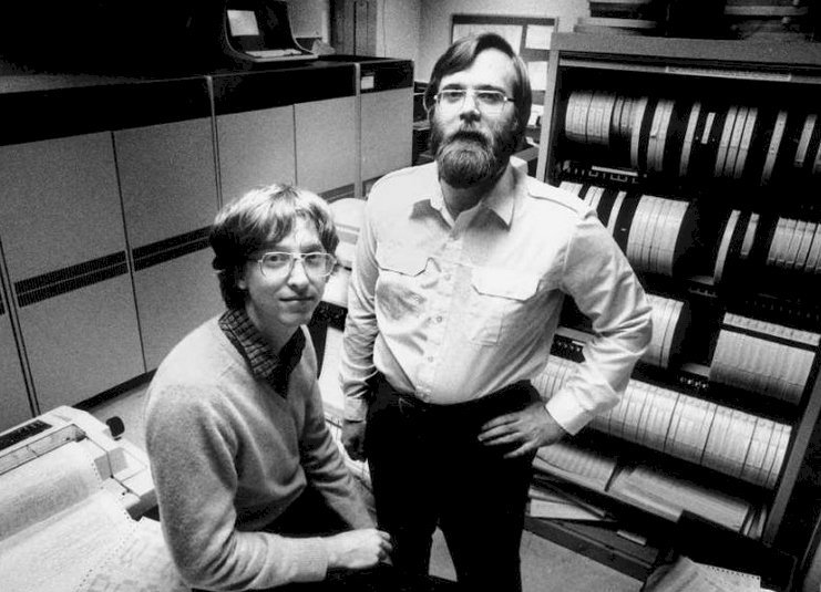
In 1975, two men named William (Bill) Gates and Paul Allen, who met each other at Harvard University, decided to start a computer software company. Like most entrepreneurs, they weren’t too interested in completing the studies for their degrees, choosing instead to focus on their shared dream. For this reason, Bill Gates dropped out of university after only one year of study.
Gates believed in practical implementation when it came to his software. He used his basic knowledge from college, which was influenced by his real-life experiences. Instead of focusing on academia, he focused on creating something timeless through creative means.
Gates had a good grasp of technology and were smart when it came to computers, but inconveniently for him, he was no programmer. He hired a programmer to create a simple operating system (DOS) to be put onto IBM computers. Gates was an excellent and shrewd negotiator, and he had convinced IBM’s CEO’s that he could license an operating system that would help their company sell their new business computers which, at the time, ran at an astounding speed.
The first stage of the Microsoft firm was underway.
Gates negotiated for full rights on the operating system, and IBM agreed, stating that the future of computers was in hardware, not software. How wrong they were. He paid $54,000 for the full licensing rights to a programmer on the DOS system and sold it to IBM successfully.
This helped Gate’s new company get off the ground in a very tangible way.
The Gates-Jobs Connection
Bill Gates soon heard through the grapevine that another young entrepreneur was making a substantial impact on technology. His name was Steve Jobs, who caught Gates’s attention when he released his Apple 2 computer.
Gates decided to keep an eye on Jobs and eventually asked him to work for Gates to learn the concept of UX at the core of the software. It was during this period that Gates got the idea for a Windows operating system that was going to be a historical creation.
While the Windows system set the Microsoft Company off to reach its great financial heights more than anyone could ever imagine, its operating system is the most recognized globally.
The Microsoft Logo
By 1975, Microsoft had built itself up to one of the most successful software companies there has ever been. After creating their fantastic technology, Microsoft turned their attention towards their logo and brand after founding their company. On April 4th, 1975 Bill Gates and Paul Allen founded Microsoft, and their first logo was a fantastic one for that era. Gates and Allen created the logo themselves.
The round edges and concentric lines from the all caps word mark had a considerable disco aesthetic influence, which was timely of the mid-70’s. It was always destined to change and evolve in the future.
Evolution of the Microsoft Logo
![]()
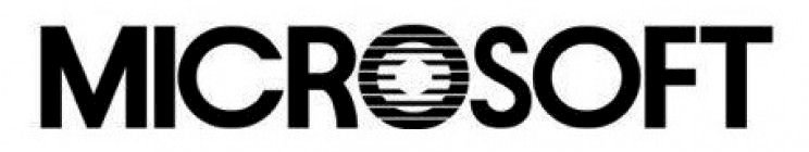
To remain appealing and culturally relevant to the newly emerging computer industry, Microsoft put effort into a brand-new logo that was bolder than before. Microsoft launched Xenix in 1980, which was an updated version of the UNIX operating system, so the logo design took on a ‘heavy metal’ type look.
There are diagonal lines on letters M, R, and F, the sharp edges, exaggerated stems. Any onlooker would agree that the company looked more like a heavy metal music label than a software provider. Despite this, many people favored the new logo of the logo, but the design only lasted for two years. After that, Microsoft went back to classic typography.
The Birth of the Blibbet
 The wordmark of the logo was distilled into a solid sans-serif and geometric font, which was more in keeping with the companies ambitions to be modern and suitable for a global market. Also, the letter O was created out the series of parallel lines, and the Microsoft employees nicknamed the icon as ‘Blibbet.’
The logo was incredibly well-received, and during this period, Microsoft launched Microsoft Windows in 1984 – It was a collaborative project with IBM. The Blibbet was a standalone logo and was used as the showpiece of the company on all stationery and products.
The Blibbet was a quaint and unassuming footnote in the history of the Microsoft logo but a memorable one that marked a pivotal step on the companies journey towards greatness.
The Pac Man Logo
![]()
By the end of the 1980s, Windows had become a global success story. With the end of the 80s, windows become an international face successfully. With the invention of arcade video games, the Microsoft department, who was responsible for the logo design, took the influence and created the Pac-Man logo.
It emphasized and highlighted the word ‘soft’ with a slash between O and S, but F and T were then joined. Microsoft’s logo’s central part was altered with tweaks over the next few years. In 1990, The Microsoft Office suite was introduced.
The use of title case and bolder wordmark logo made the branding unique to all previous logos. The silver craved triangular sides; the companies workers dubbed it with Pac-Man nickname. Also, the emblem enjoyed a very long and prestigious run – 25 years in total! Only additional taglines and descriptive fonts were added to this logo from 2006-2011.
The Microsoft Logo Slogan
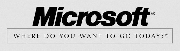
In 1994, the slogan “Where do you want to go today?” was added to the company’s logo repertoire. A historic moment came when on August 24, 1995, Windows 95 was launched. Not only that, but the Xbox360 games console launched in 2001, and 2006 saw the slogan changed to “Your potential, Our passion.”
In 2007, the short-lived but solid steppingstone operating platform, Windows Vista, was launched, and three years later, in 2010, the Windows Phone OS started to replace Windows Mobile. Then in 2011, Microsoft decided it was time for another change in slogan; ‘Be What’s Next’ was used with the same logo design as before. With this change in place, The Metro design language rebranded all products, logos, websites, and services after its completion.
The Microsoft Brand
 A new logo was launched on August 23, 2012. The Microsoft team brainstormed, and the bright, colorful, and eye-catching logo resulted from collective employee creativity. As a direct quote from Microsoft states:
“The brand should evolve to visually accentuate this new beginning, as the company prepares for the launch of its new products. The logo takes its inspiration from our product design principles while drawing upon the heritage of our brand value, fonts, and colors.”
There were two primary elements included in the logo, the symbol and the logotype. The logotype uses a Segoe font in a grey tone while keeping the F and T merged. The emblem logo design was created from four bright colors, including red, green, yellow, and blue, in a square window shape, intending to show the company’s diverse portfolio of products.
After that, Microsoft launched Windows 8, Windows Phone 8, new Xbox Services, and a new version of MS Office in 2012 as well. Moreover, the most interesting aspect of the symbol was that the famous four-box icon not just represented a color-coded suite of Office applications. For example, the blue for Word, green for Excel, red for PowerPoint, and yellow for Outlook helped to launch the continuing success of Microsoft’s Windows.
It was the first time Microsoft used the Segoe UI typeface. The font used not only pre-existing design materials and marketing utilities, but it was also placed on the software packages of the operating systems on mobiles, desktops, and laptops.
How the Microsoft logo has worked for the company
![]() Today, Microsoft’s net worth is upwards of $70 billion, and although they haven’t been the perfect firm, they have had exceptional success across the world for many decades now. Also, it has led to the success of Bill Gates, giving him the honor of becoming the world’s richest man.
Today, Microsoft’s net worth is upwards of $70 billion, and although they haven’t been the perfect firm, they have had exceptional success across the world for many decades now. Also, it has led to the success of Bill Gates, giving him the honor of becoming the world’s richest man.
Today the Microsoft logo is a paragon of greatness across the world of technology. It stands for vital innovation in technology that has brought the computer to every ordinary person by the easy to use and user-friendly Windows operating system. Several Windows versions have continued to grow and succeed, and many new attributes, icons, and apps have been added over the years. The updates, and additions were purely based on what users want in their operating systems, showing how much customer reviews and customer loyalty mean Microsoft.
As out modern-day technology changes and grows from the past 40 years. The iconic Microsoft logo stands as a symbol of trust and quality in the company. Their operating systems have opened opportunities all over the world with their accessibility and ease of use.


